Live forecasting benchmark

    Watch a forecast track the demand it never saw.

    Upload sample sales data. buffers.ai replays the last six months — predicting demand it was never shown — then measures, model by model, how close each forecast lands to what really happened.

    One input — your sales history. No promises, just the numbers.

    Backtest · held-out demand Actual Best-fit forecast
    BACKTEST WINDOWJUN ’24JUN ’25JUN ’26
    13 months · 1 SKU shownWAPE 6.8%
    Inputs

    All we need is your sales history.

    Other tools make you hand-curate holiday calendars, promotion flags and event tables before you see a single forecast. buffers.ai learns those patterns straight from your demand — and proves it on data it was never shown.

    • Sales history, per productRequired
    • Holiday calendarsNot needed
    • Promotion & event tablesNot needed
    • Weather, prices, anything elseNot needed
    Method

    How the backtest works.

    From raw sales to a model you can trust, in four steps.

    1. 01

      Send sample sales data

      Just historical sales per product. No holidays, promotions, events, or weather — one clean signal in.

    2. 02

      Race five engines

      Your data runs through TimeSFM, LightGBM, Prophet, Exponential Smoothing and a Moving Average, in parallel.

    3. 03

      Backtest six months

      Each model predicts a rolling window it never saw, scored on WAPE, bias, safety stock and service level.

    4. 04

      Crown the best fit

      The model that tracks real demand most closely wins — with the receipts to show how close it landed.

    The field

    Five engines, one winner.

    We don't bet on a single algorithm. All five run on every product; the backtest decides.

    TimeSFM

    Google · Foundation model

    A time-series foundation model, pre-trained on billions of points, then pointed at your demand.

    LightGBM

    Microsoft · Gradient-boosted trees

    Trained across the whole catalogue, reading product attributes — color, price, season, style — so similar products inform each other.

    Prophet

    Meta · Trend + seasonality

    Decomposes demand into trend and seasonal waves — sturdy, interpretable, hard to beat.

    ExpSmoothing

    Statistical baseline

    Classical exponential smoothing — the line every fancier model has to clear to earn its keep.

    MovingAverage

    Statistical baseline

    A plain day-of-week average of recent weeks — no parameters, the simplest yardstick in the field.

    Evidence

    The backtest, in the open.

    Every forecast is replayed against the demand that actually happened — so you can judge the fit with your own eyes. Nothing is hidden behind a score: every number is laid out so it's easy to track, debug and understand.

    Ref. 01Industry WAPE benchmarks
    SegmentIndustry typicalBest-in-class target
    Core replenishment20–30% WAPE<20% WAPE
    Seasonal fashion25–40% WAPE<25% WAPE
    Trend fashion30–45% WAPE<30% WAPE
    New products40–60% WAPE<40% WAPE
    Published demand-forecast accuracy bands by category — a yardstick for where a WAPE lands before you weigh ours against it. Source: EasyReplenish industry benchmarks →
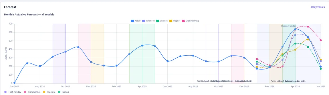
    Fig. 01Actual vs. forecast
    Actual demand vs. each model's forecast across the backtest window
    Actual demand (solid) against every model's forecast (dashed) across the six-month window. The closer the lines track, the better the fit.
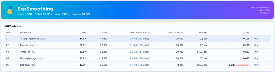
    Fig. 02The leaderboard
    Leaderboard of the five models ranked by composite score, with the best model highlighted
    Each model scored on WAPE, bias, safety-stock days and service level — ranked into one leaderboard, with the best fit crowned automatically.
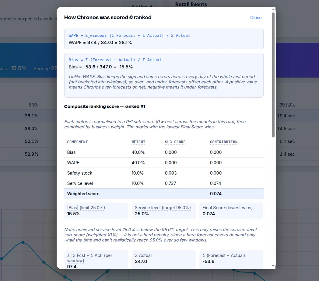
    Fig. 03The score, explained
    Dialog showing how a model is scored and ranked: the WAPE and Bias formulas with real numbers, and the weighted composite that decides the winner
    How a model earns its rank — WAPE and Bias worked out from the real totals, then each metric weighted into one composite. You can see the exact numbers behind every “#1”, including why the winner won.
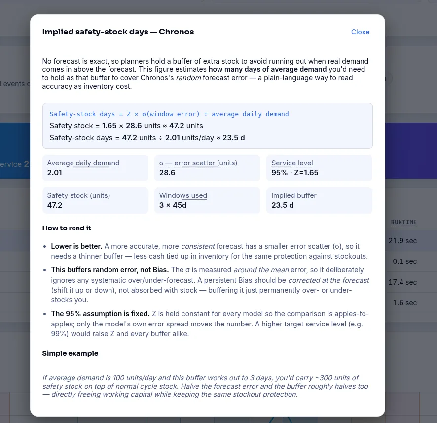
    Fig. 04The math, unfolded
    Dialog showing the implied safety-stock-days calculation in plain language: the formula, each input value, and a worked example
    Click any score and the math opens up in plain language — the formula, every input that fed it, and a worked example. No black boxes: each figure traces back to where it came from, so the result is easy to audit and trust.
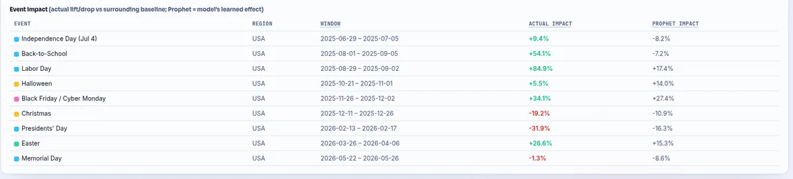
    Fig. 05Event impact, decomposed
    Table breaking out each holiday and promo window, comparing the actual lift or drop against the effect Prophet learned
    Every holiday and promo window broken out — the lift or drop that actually happened, side by side with the effect the model learned. When the two disagree you can see exactly where, and by how much.